
Layout widget
Tabs
Content in tabs — horizontal, vertical, or an accordion on phones. Every panel holds any widgets.
Build it with your AI
“Add tabs for Design, Build and Launch, each with a short paragraph and an image.”
Live demo
See it working
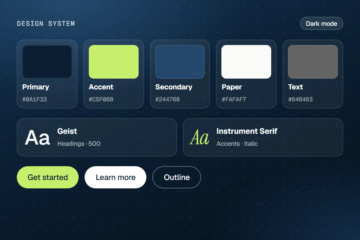
Set your colors, fonts and buttons once in the Design System.
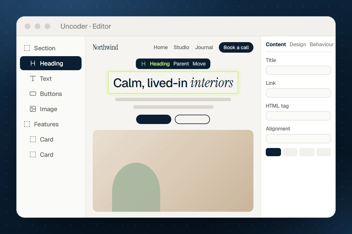
Build pages on a live canvas — or ask your AI to build them.
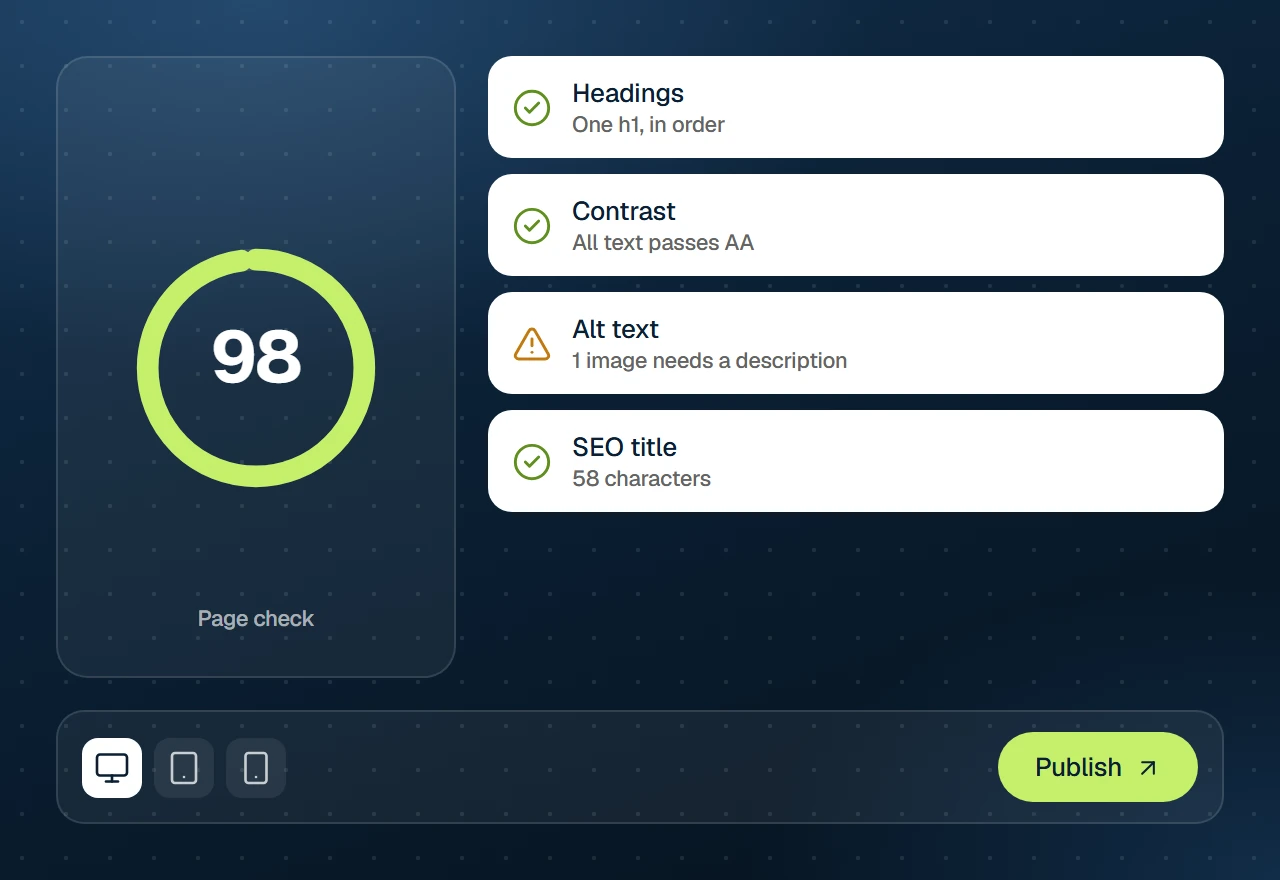
Check every device and run the page check, then publish.
Settings
37 settings in three tabs
Every setting below is in the editor — and available to your AI through get_widget_schema.
Content
10 settings
Tabs
Tabs
Initially open tab
Layout
Tabs alignment
Title alignment
Icon position
Accordion icon
Panel transition
Deep linking
Accessible name
Design
27 settings
Tabs
Typography
Space between tabs
Distance to content
Tab list width
Padding
Border radius
Show indicator
Indicator color
Indicator thickness
Divider line color
Divider line width
Background
Text color
Border
Shadow
Border color
Icon
Size
Spacing
Color
Active color
Content
Background
Border
Border radius
Padding
Shadow
Accordion layout
Space between items
Icon color
Behaviour
shared
On every element
Spacing & position
Background & border
Animations
Motion & effects
Scroll & mouse effects
Visibility
Conditions
Interactions
Attributes & CSS
Build it with AI
Just describe what you want
Your AI looks up the Tabs settings over MCP and writes the element for you — real, editable and on brand.
Claude · connected to your site
You
Add tabs for Design, Build and Launch, each with a short paragraph and an image.
Claude · using Uncoder
Done — it’s on your site and fully editable.
What the AI writes
{
  "type": "tabs",
  "settings": { "tabs": [{ "title": "Design" }, { "title": "Build" }, { "title": "Launch" }] },
  "children": [
    {
      "type": "container",
      "label": "Tab panel",
      "settings": {
        "direction": "row",
        "direction_mobile": "column",
        "gap": { "size": 24, "unit": "px" },
        "align": "center",
        "_padding": {
          "top": 16,
          "right": 0,
          "bottom": 16,
          "left": 0,
          "unit": "px",
          "linked": false
        }
      },
      "children": [
        {
          "type": "container",
          "label": "Text",
          "settings": { "width": "45%", "width_mobile": "100%" },
          "children": [
            {
              "type": "text-editor",
              "settings": {
                "content": "<p>Set your colors, fonts and buttons once in the Design System.</p>"
              }
            }
          ]
        },
        "… 1 more like this"
      ]
    },
    "… 2 more like this"
  ]
}